
All in one: mobile, tablet ánd desktop
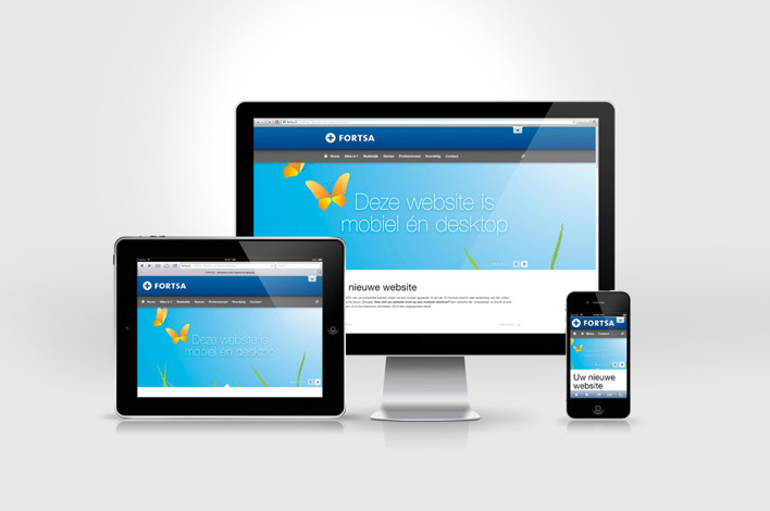
Many websites are (still) built according to a supposed ‘standard’ screen size. Which is not very convincing when viewed on a ‘full HD’ screen, a tablet or for example a mobile phone. With Responsive Design the layout automatically adapts to the screen of the user. Whether it's a PC, tablet or smartphone. But there is more.
First impressions count
Although we know you shouldn't judge a book by its cover, a person by their looks or a company by its homepage, we all do in some way or another. If your homepage is found through a search engine it is probably your (company's) first impression. What kind of first impression does your website give?
User experience
The main goal of our website is getting visitors to take action. Whether it's getting in contact, requesting a quote or sharing the information through social media. The ‘user experience’ of your website plays an important role. Let's make their visit as pleasant as possible!
More convincing, more convenient, faster
Our websites are built from the ground up on the principle of responsive design. Considering large and small screens, what is (older browsers) and what is to come (faster mobile Internet), the needs of search engines ánd those of regular visitors. This results in websites which are more convincing, more findable, more convenient, more effective and faster!


